Systems Built
What We Actually Built
Seven engagements. Seven different operating problems. Seven systems running in production right now.
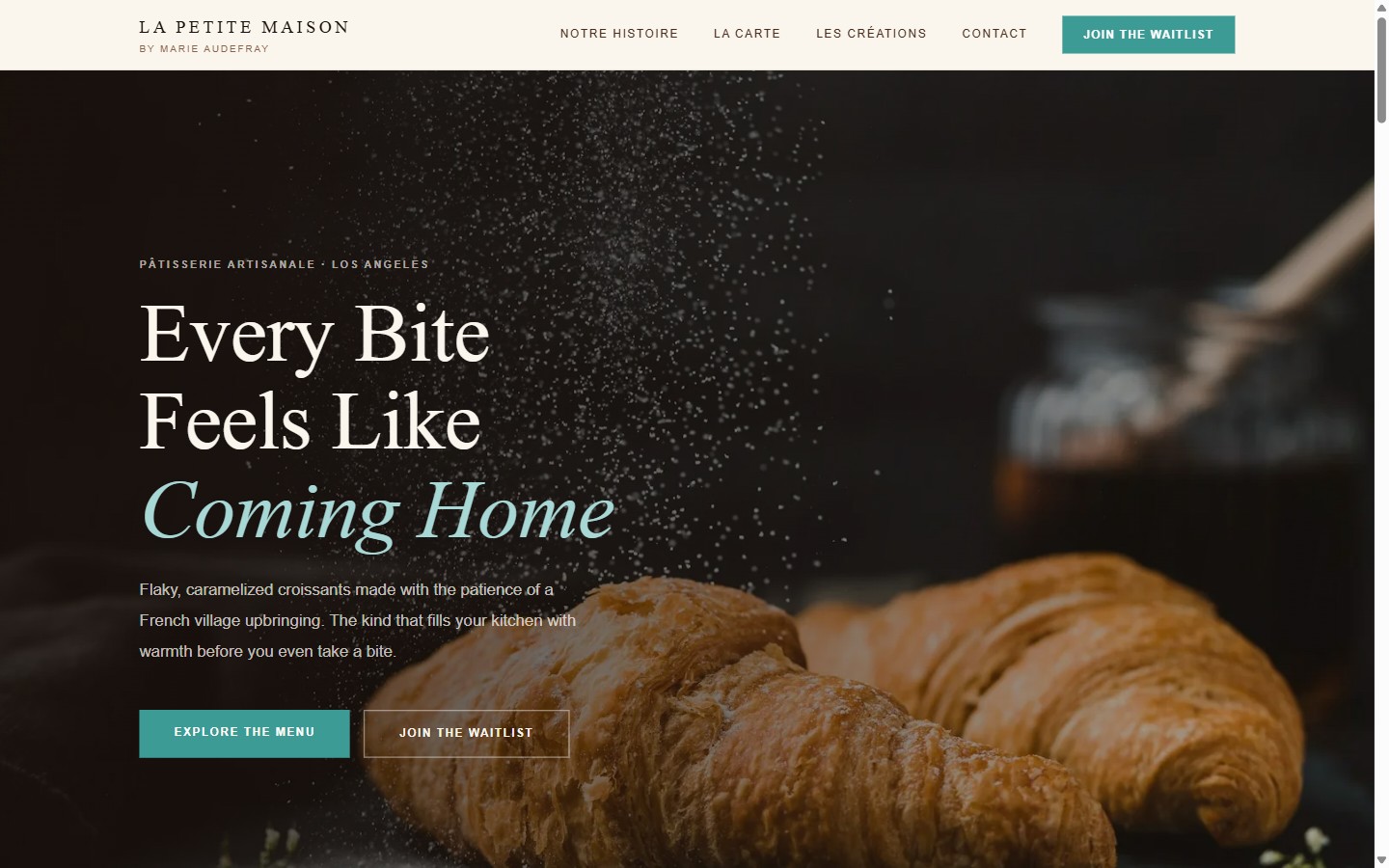
01 / La Petite Maison
Customer-Facing Layer
Artisan French Bakery · Los Angeles, CA
CUSTOMER VIEW
Editorial site, warm cream tones, EB Garamond typography, full online menu showcasing signature pastries. Loads fast on mobile, where most bakery searches happen.
ADMIN VIEW
Contact inquiries land directly in Marie's inbox via EmailJS, no dashboard to check, no third-party CRM required.
WORKFLOW / DATA
Structured markup and search-friendly metadata built in from the start. Zero-template custom build, every element written for this business specifically.
BUSINESS IMPACT
"The design was personalized to my business. We had a few conversations, and that was really all it took.", Marie
CUSTOMER VIEW
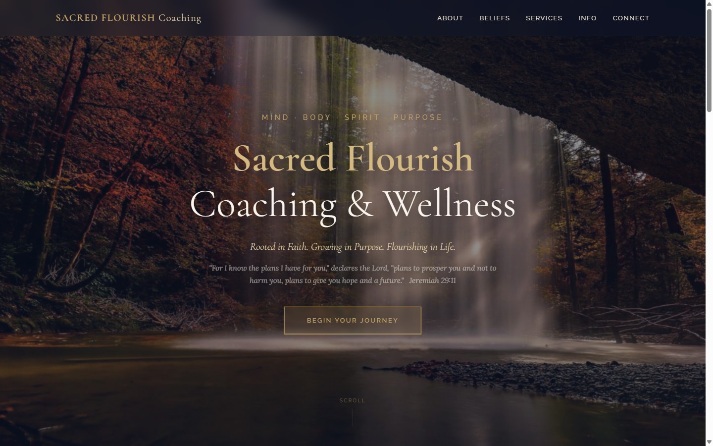
02 / Sacred Flourish
Customer-Facing Layer + Contact System
Faith-Based Coaching & Wellness
CUSTOMER VIEW
Serene, faith-anchored site, soft sage greens, editorial typography, testimonial showcase built to feel like a deep breath before someone reaches out.
ADMIN VIEW
Dual-email contact routing via Resend API, inquiry goes to the founder and a confirmation goes to the client simultaneously. Interest field captures service focus before the first conversation.
WORKFLOW / DATA
Honeypot spam protection on the contact form. Booking link routes to the scheduling tool. Structured testimonial display. Zero-template build.
BUSINESS IMPACT
A clinical-feeling presence replaced with a trust-first design that reflects what her practice actually feels like, before anyone picks up the phone.
CUSTOMER VIEW
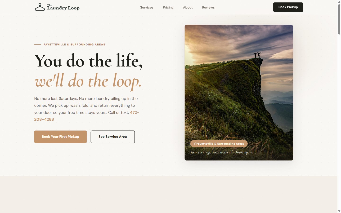
03 / The Laundry Loop
Booking System + Automation Stack
Laundry Pickup & Delivery Service
CUSTOMER VIEW
Conversion-focused booking flow, service options, pickup scheduling, pricing, and mobile-first layout for customers placing orders from their phones.
ADMIN VIEW
Review moderation pipeline built on Vercel Blob, submissions enter a pending state and only surface publicly after approval. Content sanitization runs on every submission. Customer details captured at intake: name, email, phone, address.
AUTOMATION / AI
Polaris Outbound handles outbound in the background, automated email sequences and follow-up logic run without Alicia touching them between pickups.
BUSINESS IMPACT
"They take their time and really cater to the client's needs. So patient.", Alicia. New customers book in under two minutes without a back-and-forth text thread.
CUSTOMER VIEW
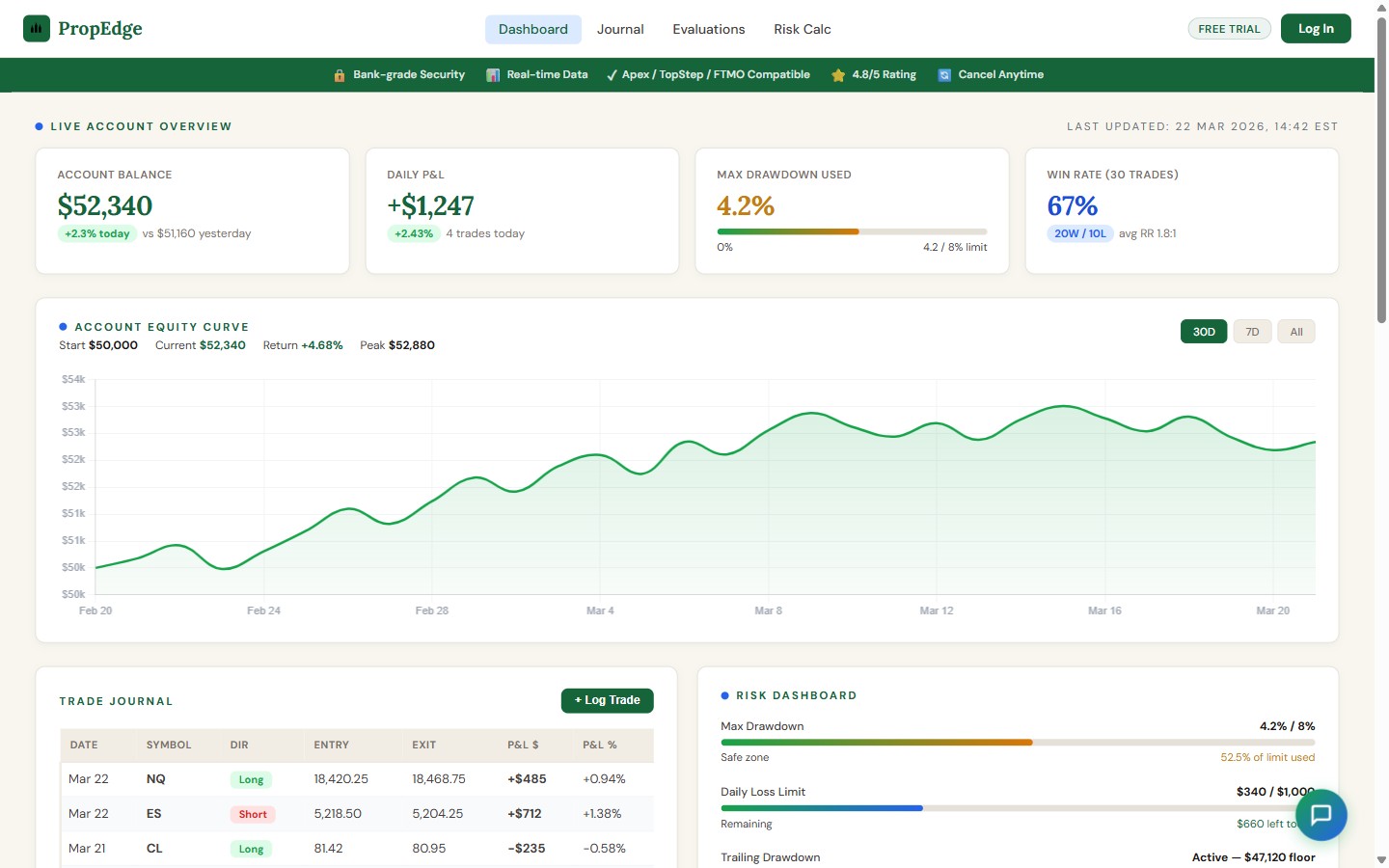
04 / PropEdge
Full-Stack SaaS Platform
Prop Trading Dashboard & Analytics
CUSTOMER VIEW
Dark dashboard, structured P&L tracking, trade journal, drawdown meter, evaluation tracker (Apex, TopStep, FTMO), and risk calculator. Built for traders who need clarity, not decoration.
ADMIN VIEW
Stripe webhook activates Pro tier on successful payment. Subscription billing manages access state, pay and get in, lapse and get gated. Timing-safe webhook verification.
AUTOMATION / AI
Gemini Flash AI chatbot ("Edge") handles trader questions, position sizing, rule lookups, trade review, without leaving the platform. Chart.js powers data visualization across all performance views.
BUSINESS IMPACT
A complete trade management platform at a price point prop traders can actually justify. Subscription-gated Pro tier running in production.
CUSTOMER VIEW
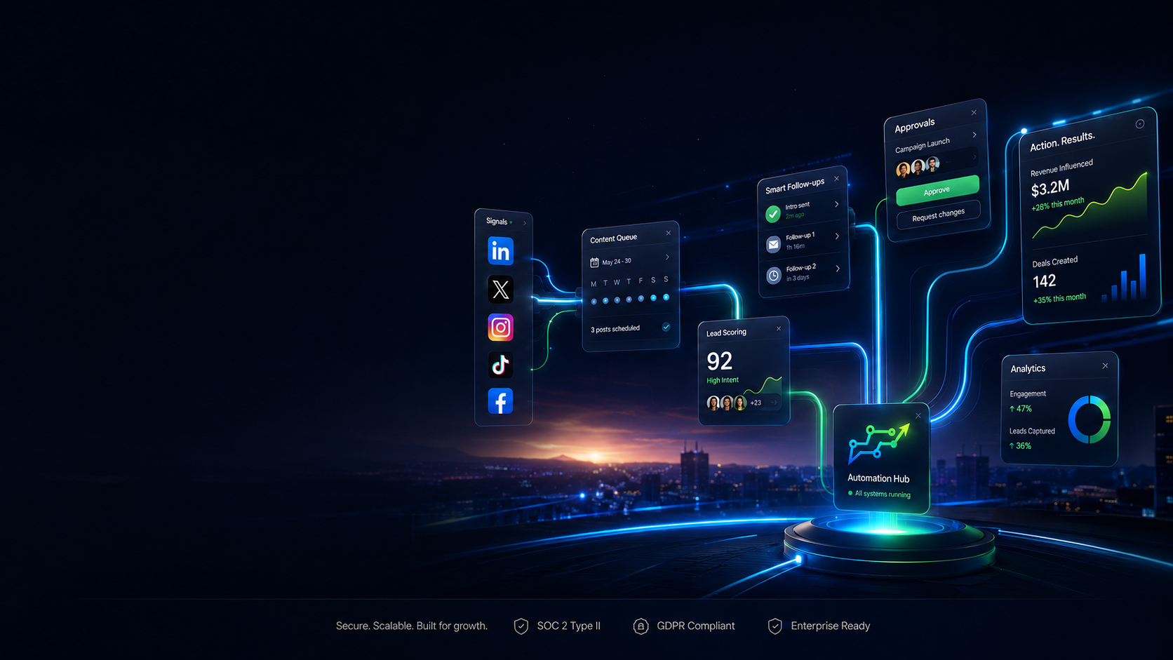
05 / Polaris Outbound
Marketing Automation Platform
Built + Operated by Polaris · Live SaaS Product
CUSTOMER VIEW
Marketing automation SaaS, landing page, onboarding flow, pricing tiers, and campaign dashboard. Subscribers connect their business and the outbound pipeline starts.
ADMIN VIEW
Campaign management, lead pipeline tracking, social publishing queue, and subscriber account controls, all managed from a single backend admin.
WORKFLOW / DATA
Two-layer lead scoring engine with niche detection. Backend workers processor runs warmup ramp, personalization, spam scoring, and campaign sequencing without manual input per campaign. Multi-service architecture with graduated send logic.
BUSINESS IMPACT
Built because nothing off-the-shelf ran the way we needed it to. Now powers outbound for Polaris clients including The Laundry Loop. Available as a standalone subscription for any small business.
CUSTOMER VIEW
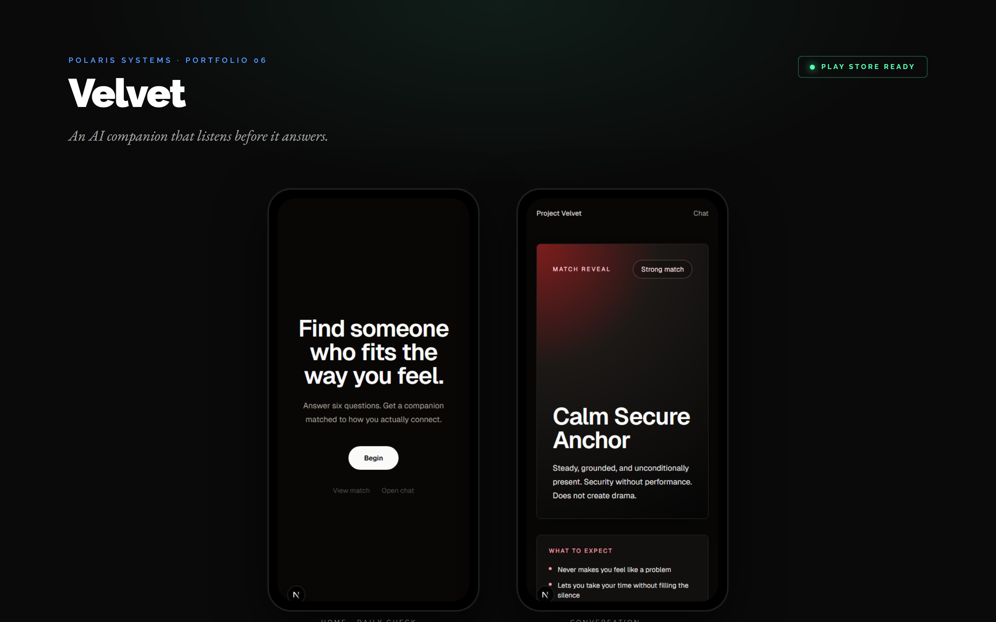
06 / Velvet
AI Emotional Companion App
Mental Wellness · Mobile App (iOS + Android via Capacitor)
CUSTOMER VIEW
Six-question intake matches each user to a companion that fits how they actually connect. Daily check-in, mood log, and a chat surface that listens before it answers.
ADMIN VIEW
Safety pipeline with content moderation, crisis-language detection, and session boundaries. Profile editor, match controls, and conversation history reviewable from a single operator screen.
WORKFLOW / DATA
Next.js web shell wrapped with Capacitor for native iOS and Android builds. AI conversation engine carries memory across sessions, with the safety layer running every turn before response.
BUSINESS IMPACT
Play-Store-grade build proving Polaris ships full mobile apps, not just websites. The same app architecture is reusable for any client that needs a branded mobile product on top of a web platform.
CUSTOMER VIEW
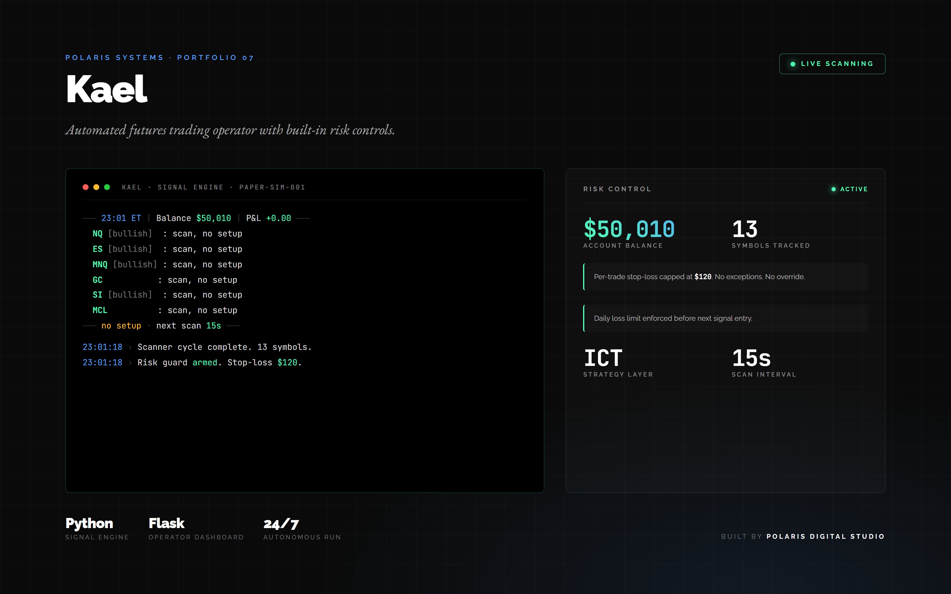
07 / Kael
Automated Futures Trading Operator
Algorithmic Trading · Private System Built + Operated by Polaris
OPERATOR VIEW
Live Flask dashboard showing scan cycles, signal log, open positions, balance, and daily P&L. Built so the operator can verify what the bot did and why, without reading code.
ADMIN VIEW
Risk rules, symbol list, strategy weights, and account configuration. Every parameter is editable from one panel, with a hard $120 per-trade stop-loss that cannot be overridden mid-session.
WORKFLOW / DATA
Python signal engine scans 13 futures symbols every 15 seconds using ICT strategy logic. Setup detection, entry, stop placement, and managed exit run autonomously. Trade and signal history persisted to disk.
BUSINESS IMPACT
Proves Polaris builds 24/7 autonomous operators with real money on the line. Same architecture pattern (signal layer, risk guard, operator dashboard) ports to any client that needs an unattended decision engine.
OPERATOR VIEW
You just saw what we actually build.
Seven systems. All in production. Yours starts with a Blueprint.